OK, given that my current livelihood is tied to Microsoft Outlook’s success, I’m a shill. But the blog pundits have been using this week’s official launch of Vista and Office 2007 as an opportunity to compile their lists of likes or dislikes of the new products and I feel I have to put in my two cents. I love Outlook 2007. I’ve been using it full time since Beta 2 and think it’s a great improvement over previous releases. Hopefully without coming across as too much of a fanboy, here’s my top five reasons why:
1. Integrated Search
Outlook 2007 indexes your mail file and provides a lightning fast search results via a search box integrated into the app, right above the message list:
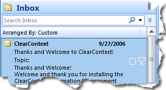
This is one of those features that should have been Outlook from the beginning, making it extremely easy to find the message you are looking for just by typing in a few keywords. Sure, you can download any one of a number of free desktop search applications that provide this functionality; but the integrated search is easy to use and provides results right within the Outlook interface. Think of the millions of hours that will be saved by average workers when they start using this feature. It’s easily the single biggest time saver in the new release.
2. Collapsible Navigation Pane
I really liked the addition of the the right side preview pane in Outlook 2003, but I felt like the UI was starting to look a little too busy. The Outlook 2007 team answered my critique with a collapsible navigation pane:
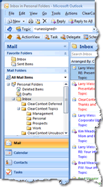
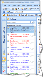
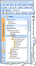
Hiding the folder list and other navigation elements on the left hand side of the Outlook interface opens up a good deal more space for the preview pane, which in turn ensures that I rarely have to open a message to read or act on it. If I need to open a folder, I can temporarily expand the navigation pane by clicking on it to see my complete folder list. Because I use ClearContext filing functionality to move messages out of the Inbox, I only navigate to my folders when I’m looking for something, so hiding the list and opening up more space is a big plus.
3. Attachment Preview
The Outlook 2007 Preview Pane allows me to preview my attachments when I click on them:
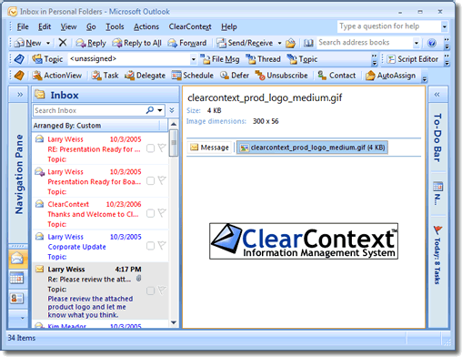
This is another time saver for me. Viewing pictures or Word Documents is a snap, appearing right in the Preview pane without launching another window. This feature is only marred by the fact that it doesn’t universally open all attachments (for example, PDF files) but instructions are available to create your own viewer if you’re so inclined.
4. Better Viewing of To Do’s
There are two new ways to slice up tasks and calendar data in Outlook 2007 – the 2007 calendar shows the day’s assigned tasks in addition to appointments and the pervasive To Do bar gives a quick view into tasks and appointments throughout the rest of the app:
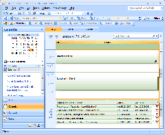
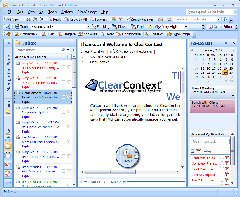
This is just a better way to slice up information in Outlook. One of the reasons we built the ActionView into ClearContext is that previous versions of Outlook didn’t recognize that "to-do’s’" – appointments, tasks, and flagged items – are scattered across multiple silos, making it difficult to get an integrated picture of everything that’s on tap for the day. In Outlook 2007 tasks and flagged messages are displayed alongside appointments, making it much easier to see what I should be working on and when.
5. Integrated RelatedView
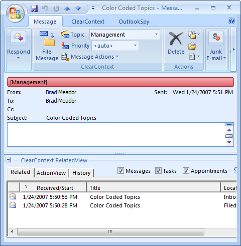
OK, this may be cheating, but hear me out. The killer feature in Outlook 2007 for me is ClearContext’s integrated RelatedView:
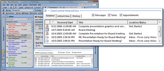
This IMS Pro feature, integrated directly into every message – is only available on 2007 and shows all messages, tasks and appointments in the current conversation. This gives a very clear picture of all past communications regarding this subject and any actions that have been taken on it. I write this up as one of my five favorite features of Outlook 2007 because previous releases did not afford us the opportunity to automatically integrate this information right into the message itself. For this release, the Outlook team put a lot of work into providing more robust hooks into the application so that partners like ClearContext can build a seamless experience for their customers. Look for even tighter integration from ClearContext and other add-in vendors as we continue to take advantage of the new API’s that Outlook 2007 provides.
Honorable Mention: Category Integration
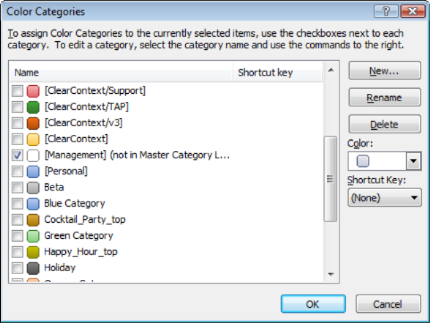
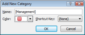
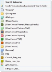
As I discussed earlier, I’m also a fan of the better exposure of categories in Outlook 2007.
The bottom line here is that I find the changes made to Outlook for the new release provide significant productivity gains over previous versions of Outlook – it just fits better with the way that I work. If you like the Ribbon UI in the other apps (which, for what it’s worth, took me several weeks to get used to, but now I would not want to go back), then it’s definitely worth the upgrade.
BONUS: See Deva’s thoughts on Outlook 2007 in his interview with OutlookPower magazine.
 In conjunction with today’s formal launch of the 2007 Microsoft Office system, we’re rolling out a limited-time offer that should be attractive to those of you who are upgrading your team to Outlook 2007. Thoughout the month of February we will provide a 25% discount off all group license purchases of 25 or more copies of ClearContext IMS Professional for companies that are upgrading to Outlook 2007. If interested, drop a line to sales at clearcontext dot com for more detail.


 In the Inbox, Select a message with the Topic assigned that you intend to color-code.