Last week we rolled out a preview of ClearContext Online. This week I’ll spend some time introducing you to our new features. First things first – take the tour!
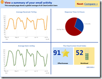 View a snapshot of your email activity on your ClearContext online home page. This includes:
– Average messages sent and received
– Response time
– Email Effectiveness
For an example, view averages for all ClearContext Users.

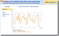
Compare your statistics with other users and groups, including:
– Sent and Received
– Replies and Responsiveness
– Inbox Size, Unread
– Effectiveness and Workload
For an example, see this comparison of our CEOs email performance to the average ClearContext user. After sign up, this page shows additional groups for comparison.

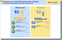
The ClearContext Scorecard allows you to evaluate your performance against others, including:
– Effectiveness and Workload
– Response Time and Communication
– Inbox Control
Evaluate the average effectiveness and workload for all ClearContext users. After registration, use this page to compare your scorecard against individuals or groups.
 If you’re ready to get started, download and install ClearContext and click Compare your stats online on the Scorecard.
Posted by brad at 3:51 pm on June 22nd, 2009.
Categories: metrics, online.
In our previous post, we started looking at some basic email volume statistics and began to think about how we can use that info to become more effective in working with email. We also looked at how the Thanksgiving holiday impacted email activity. In this post we’ll take another look at those statistics to see how consistent they really are in terms of baselines to evaluate our own email activity levels against, as well as see what kind of impact the holiday season had on email volumes.
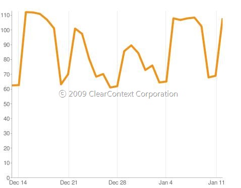
First we’ll take another look at received email volumes. The average stays around 110 per weekday before and after the holidays, but email volumes are drastically lower for two entire weeks. Not a surprise, but it’s still interesting to see the rapid declines approaching both Christmas and New Year’s, and then the quick return back to business as usual right after.

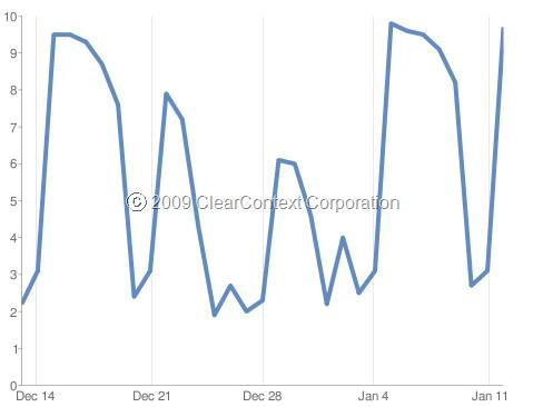
Now, does that mean people’s overall workload is going down at those levels? Well, there are a number of factors to take into account, but one of the most basic measures is to simply look at how many messages people are replying to. As the graph below shows, the number of replies people are sending tracks quite closely with the reduced volume of emails being received, so it does appear that overall email workload was reduced over the holiday season. It’s good to know that at least everyone wasn’t just at home catching up with all of their overdue email replies!

OK, now we’ve established some baseline metrics in terms of inbound email volumes and outbound email reply volumes. So what do we do with that and how can we help people and companies use that information to get better at handling email effectively?
In the next post we’ll discuss some of the ways all of this information can be used to measure the level of email workload people are facing, identify key sources of email strain, measure effectiveness levels in dealing with the email, and provide suggestions so people and companies are able to get better at managing all of this email.
Posted by brad at 4:35 pm on January 22nd, 2009.
Categories: metrics.
At ClearContext, we’re focused on helping make email a more effective tool. This spans a number of areas including filing messages and keeping your inbox under control, managing tasks and activities within email, and keeping projects organized inside Outlook. The products that we’ve built help many people who live their work life inside of Outlook stay in control of an overwhelming flood of information. But we are continually asked two very important questions:
- Exactly how big a problem is all this stuff?
- How much can these solutions help?
We’ve spent a long time thinking about those issues and working with users and companies to figure out how to both identify the key areas of email pain they face, and provide solutions that make direct and measurable improvements in those areas. We’ll be announcing more details shortly, but if you’re interested in learning more right now, please contact us at beta at clearcontext dot com.
In the meantime, we’re going to cover a few key areas where people can measurably increase their effectiveness and productivity with email over our next few blog posts. To get started, we’ll take a look at some baseline figures illustrating the volumes of work people are faced with. We’ll start by looking at a couple of the most basic email stats.
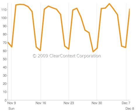
The graph below from a sample group of ClearContext users shows the average number of messages they receive in their primary business inbox every day. You’ll notice that it remains relatively constant at about 110 emails per day during the week and a little over half that amount on weekends. You’ll also notice a significant drop-off in email volume around US Thanksgiving, but after the weekend things pretty much immediately pick up right back where they left off.

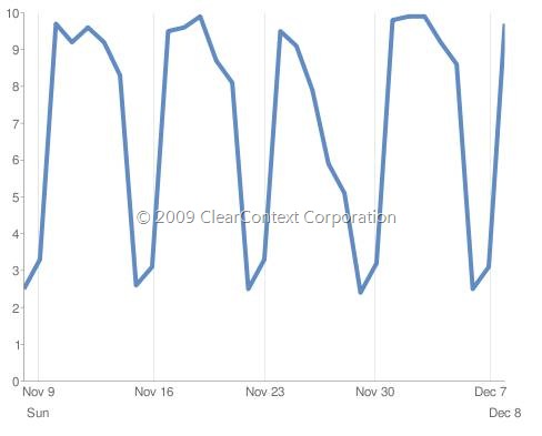
Of course we know we’re all receiving a lot of email. So, how much of that email generates even more work in the form of a required response? Well, simply by looking at the shape of the graph below of replies sent on a daily basis, you can see that (as you might expect) there’s a direct correlation between the amount of email received and the number of replies sent out.

In our next post we’ll take a look at how email volumes were impacted over the holiday season and start discussing how this information can be used to help people be more effective and less stressed out with email.
Posted by brad at 6:09 pm on January 7th, 2009.
Categories: metrics.
 View a snapshot of your email activity on your ClearContext online home page. This includes:
 If you’re ready to get started, download and install ClearContext and click Compare your stats online on the Scorecard.