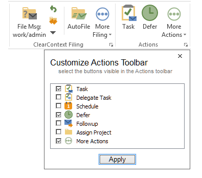
We’re getting very close to being ready with the ClearContext Pro v7 beta. In the mean time, we wanted to share one last feature preview post before fully introducing version 7. For Outlook 2010 and 2013, which use the Ribbon user interface, the ClearContext toolbar in the main Outlook window has been redesigned. Goals for the new design include a simpler, less cluttered layout and greater flexibility in customizing the ClearContext buttons in the Home tab.
In the ClearContext tab, which lists all the features of ClearContext, sub-menus have been eliminated so that all features are available without needing to open a menu. Additionally, features are organized by type, most buttons have been switched to a large format and the appearance of the icons match the style of the version of Outlook. The screen prints below show the appearance in Outlook 2013.
For the Home tab which lists a subset of the most recently used ClearContext features, each of the Filing and Actions sections can be customized to add or remove buttons from the corresponding areas of the ClearContext tab. In addition, the main filing controls have been optimized to take up less space by integrating the thread filing and undo buttons. The separate File Thread button can be added back through the customize window if the filing layout of the pre-v7 toolbar is desired.
As mentioned, we are getting very close to being ready with the v7 beta, so please check back soon for the latest news. We will initially be making the beta available exclusively to our Connect subscribers and gradually opening up access after the initial release.
New Purchasers: As of September 1, 2014, all purchasers of new or upgrade v6 ClearContext licenses will receive a free upgrade to v7 once the new version is available.

